Mobile Design & Development
Dino Riese
25 Sanford Court
Valley Stream, NY, 11581
DinoRiese.com | Mobile Responsive Web Design & App Development
Mobile Responsive Design & Development is an essential part of today's business. Your ability to reach your audience on different mobile platforms for advertising is essential to your success. Applying your brand on different mobile devices to the algorithms necessary generates authority to your website. Mobile Design & Development is exactly what i do with a passion.
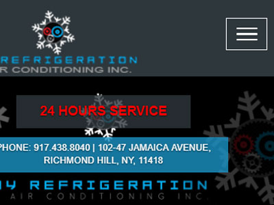
 Service | New York, Long Island, NYC, Brooklyn, Queens | Phone: 516.286.3583 | DinoRiese@gmail.com | DinoRiese.com")


 & Web Design Service | New York City, Long Island, NYC, Brooklyn, Queens | Phone: 516.286.3583 | DinoRiese@gmail.com | DinoRiese.com Inc.")

Mobile Responsive Web
Design & App Development
New York City | Long Island | Queens | Brooklyn
DinoRiese.com | Website Design Services
Mobile responsive web design is a method of developing your website so that it automatically adjusts to the screen size and device used to view the site. This ensures a consistent user experience and allows you to view your site’s content without reducing it for smaller screens, as you need to do with a mobile site. Every site created by DinoRiese.com is constructed using a fully responsive design that adapts to all electronic mediums to reach potential clients online.
DinoRiese.com specializes in creating mobile apps that serve a valued purpose for your business. Mobile responsive apps are available in multiple design formats catering to your desired target audience. DinoRiese.com creates your custom mobil application based your vision to satisfy any human need you can imagine becoming a service. If you envision together the concept, DinoRiese.com can create a mobile application to execute your ideas, allowing you to reach your optimum online business success. This takes time and planning!
What should I do to prepare to design a mobile app?
- Target your exact audience's need/s
- Organize any numeric info. for database implimentation
- Gather content necessary to achieve your business goals
- Select a mobile platform available from DinoRiese.com
- Allow a programing professional to work directly with you for revisions
Mobile Website Design & Development Services | DinoRiese@gmail.com
DinoRiese.com | Mobile Responsive Website Designs


Mobile App Designs
Mobile Responsive Application Design and Development based on your industry database requirements and implimentation needs.
Mobile Responsive Websites
All Web Design is HTML5 mobile friendly, and is seen clearly across all mediums with multiple drop menus for ease of navigation.
Mobile Web & App Updating
After branding and campaigning is complete, Web Updating plans are set up by individual client needs based on content requirements.
